
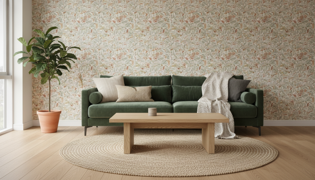

The art of transforming a living space lies in the subtle dance between elements, and in 2026, the trend of mixing and matching wallpaper with diverse textures is at its peak. This creative endeavor, while incredibly rewarding, often presents a unique challenge: how to combine disparate designs and tactile qualities into a cohesive, visually stunning narrative that truly reflects personal style. Without a clear methodical approach, the dream of a harmoniously layered room can quickly devolve into a chaotic visual cacophony. The key is not to shy away from bold patterns or rich textures, but to understand the underlying principles that allow them to coexist beautifully, creating an environment that feels both unique and inviting. From understanding the color wheel to balancing scales and tactile sensations, a well-coordinated room is a testament to thoughtful planning and an astute eye for detail, turning an ordinary space into an extraordinary masterpiece of design.
Understanding the Foundations of Pattern and Color in Interior Design
Embarking on a journey to mix and match wallpapers and textures begins with a solid grasp of fundamental design principles, primarily color schemes and pattern dynamics. Color is the emotional backbone of any room, setting the entire mood. By consulting the color wheel, one can discern harmonious relationships: analogous colors, nestled side-by-side like blues and greens, evoke a sense of calm and continuity, perfect for serene sanctuaries. Conversely, complementary colors, diametrically opposed such as vibrant orange and deep blue, ignite a dynamic energy, injecting life and excitement into a space. These relationships are not merely theoretical; they are the practical tools for guiding your wallpaper and texture selections, ensuring every element works in concert.
Beyond color, patterns introduce character and visual rhythm. Stripes can elegantly elongate a room, drawing the eye upward or across, while delicate florals infuse a natural, softer charm. Geometric patterns, a hallmark of modern design often seen transforming contemporary spaces, offer a sharp, edgy sensibility. The critical insight here lies in understanding that while mixing these patterns is encouraged, they require a common thread—be it a shared color, a consistent theme, or a similar intensity—to prevent visual discord. Moreover, the scale of a pattern profoundly impacts a room’s perception: grand patterns can make an intimate space feel cozier, while smaller motifs can expand a larger area. Strategic balancing of pattern size ensures visual harmony, transforming a collection of individual elements into a unified design statement.
Mastering Complementary Patterns for a Unified Aesthetic
Achieving a cohesive and unified aesthetic when mixing patterns is a deliberate process, not a serendipitous accident. The initial step involves selecting a “hero” pattern—a design that captivates you, whether it’s a sprawling botanical print, an intricate geometric motif, or a timeless stripe. This primary pattern acts as the anchor around which the rest of your decor will elegantly unfold. With your focal point established, the quest for secondary patterns begins, each chosen for its ability to enhance rather than compete with your initial selection. The golden rule is a shared color or an overarching thematic link; if your primary wallpaper features serene blues and crisp whites, then secondary patterns might echo these hues in a subtle polka dot or a sophisticated abstract design, creating an undeniable sense of continuity.
The interplay of pattern scale is equally vital in crafting a harmonious room. A bold, large-scale primary pattern often benefits from companions that are smaller and more understated, ensuring that no single design overwhelms the visual landscape. This thoughtful contrast allows each pattern its moment to shine while contributing to a larger, balanced composition. Furthermore, the inclusion of varied textures introduces another layer of richness and depth, preventing the room from appearing one-dimensional. Imagine pairing a luxurious silk wallpaper with the rustic appeal of a woven throw, or the smooth finish of a minimalist print with the tactile comfort of a ribbed fabric. This interplay of surfaces, from rough to smooth, matte to glossy, is essential for adding dynamic interest and ensuring that the room feels multi-faceted and inviting, pulling together all elements into a carefully curated whole.
Striking the Perfect Balance Between Bold and Subtle Decor
Creating a space that feels both dynamic and welcoming hinges on the expert balance between bold statements and understated details. The strategy here is purposeful restraint, allowing one or two dramatic elements to command attention while being gently supported by calmer, more subtle companions. Begin by identifying your bold protagonists—perhaps a modern wallpaper with an intricate, vibrant design that serves as a feature wall, or a piece of furniture upholstered in a striking, unexpected fabric. These elements are designed to be focal points, drawing the eye and making an immediate impact, defining the character of the room.
Once these bold statements are in place, the art of balancing comes into play. Surround these prominent pieces with subtle designs that provide a serene counterpoint. Think neutral-toned furnishings, minimalist accessories, or textiles with understated patterns that complement rather than compete. For instance, a vivacious floral wallpaper can be exquisitely tempered by solid-colored sofas and simple, unadorned window treatments, allowing the wallpaper to truly sing without creating visual clutter. Textural variation further enriches this balance; a plush velvet armchair, for example, can be softened by a collection of muted linen throw pillows and a subtly textured area rug. This interplay of bold and subtle, rich and refined, ensures that the room feels intentionally layered and aesthetically pleasing, reinforcing the principle that sometimes, less is indeed more, particularly when it comes to impactful design.
Essential Strategies for Seamlessly Blending Textures and Wallpapers
The successful integration of diverse textures and wallpaper designs transforms a room from merely decorated to truly designed. It’s about crafting an environment where every element, from the tactile sensation of a fabric to the visual complexity of a pattern, contributes to a harmonious whole. Here are some methodical strategies to guide this intricate process, ensuring that your space tells a cohesive story:
- Establish a Neutral Canvas: Initiate your design with a foundation of neutral colors on larger surfaces like walls (for painted areas) and primary furniture pieces. This provides a calm backdrop, allowing bolder wallpapers and vibrant textures to truly pop without overwhelming the space.
- Adhere to a Restricted Color Palette: Select a maximum of three core colors for your room, then explore their various shades and tints. This disciplined approach maintains visual continuity and prevents the room from feeling disjointed, even with multiple patterns.
- Vary the Scale of Patterns Deliberately: Incorporate a thoughtful mix of large, medium, and small-scale patterns. A grand, dramatic floral wallpaper might pair elegantly with a subtle geometric print and a tiny, repeating motif, adding visual interest without chaotic clashes.
- Introduce Tone-on-Tone Combinations: For a sophisticated and serene effect, consider wallpapers that feature similar hues but vary in texture or subtle pattern. This creates depth and continuity, as seen in the pairing of a misty blue abstract design with an indigo blue stripe, both sharing beige undertones, fostering a harmonious flow between spaces.
- Select Complementary Colors for Dynamic Spaces: Beyond tone-on-tone, purposefully combine colors that complement each other, such as blue with gray, green with beige, or the classic black and white. The key is to match the intensity of these colors—soft pinks with soft grays, for example—to ensure they work in synergy rather than vying for attention.
- Repeat Elements for Visual Cohesion: Subtly echo certain patterns or colors in different areas of the room, perhaps through throw pillows, artwork, or smaller decorative items. This repetition creates a visual thread that ties all components together, fostering a sense of unity.
- Test Designs Before Committing: Before making final decisions, utilize swatches of wallpaper, fabric samples, and paint chips. Create a mood board or temporarily place items in your space to visualize how different patterns and textures interact under varying light conditions. This proactive step can prevent costly mistakes and ensures the final look aligns with your vision.
How do I begin mixing patterns without making my room feel chaotic?
Start by choosing one primary pattern you absolutely love. This will be your anchor. Then, select secondary patterns that share at least one color with your primary pattern. Varying the scale of these patterns—mixing large with small—is also crucial for avoiding visual clutter.
Can different wallpaper styles, like modern and classic, be successfully combined in one space?
Absolutely. The key lies in finding a shared characteristic, such as a consistent color palette, a similar level of design intensity, or a common underlying theme. For instance, a modern geometric pattern in muted tones can complement a classic floral design if both share a subtle, unifying hue, creating a unique and timeless aesthetic.
What role does color intensity play when mixing various patterns?
Color intensity is paramount. Mixing patterns of similar intensity—for example, soft pastels with other soft pastels, or bold, saturated colors with other bold colors—creates a cohesive and sophisticated look. A mismatch in intensity can lead to one pattern overpowering the others, disrupting the room’s balance.
How do I ensure a harmonious flow when decorating adjacent rooms with different wallpapers?
To create a harmonious flow between adjacent rooms, aim for a common thread that subtly connects the spaces. This could be a recurring color, a consistent style (e.g., both classic or both modern), or a similar texture family. Tone-on-tone combinations, where colors are similar but patterns vary, are particularly effective for this purpose, providing continuity without monotony.
Is there a recommended number of patterns to use in a single room?
While there’s no strict rule, a good guideline is to use three distinct patterns of varying scales: one large, one medium, and one small. This approach generally creates a balanced and visually interesting space without risking an overwhelming appearance. However, skilled designers can sometimes work with more, providing they maintain a strict color palette and intentional placement.

