
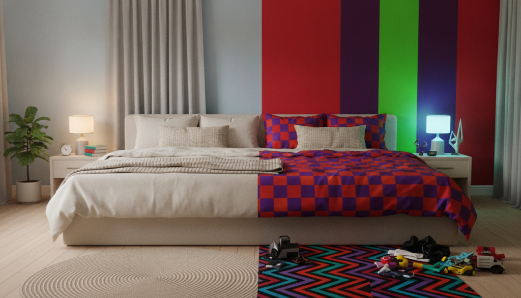

The sanctuary of a bedroom should be a haven, a space meticulously crafted for rest and rejuvenation. Yet, many inadvertently design against this very purpose, overlooking the profound impact of interior design colors on their mood and well-being. Far beyond mere aesthetics, the hues surrounding you while you sleep or unwind wield a subtle but powerful influence on your nervous system, shaping everything from your heart rate to your cognitive clarity. Imagine a room that feels perpetually jarring, or waking consistently unrefreshed, subtly sabotaged by a palette that amplifies stress rather than easing it. This intricate dance between color and psychology determines whether your bedroom truly supports emotional stability and comfort, or if it contributes to restlessness. A methodical understanding of these dynamics, therefore, becomes not just a design choice, but a critical investment in your daily peace and mental health.
The deep connection between bedroom colors and your emotional state
Color, in the realm of interior design, transcends simple decoration; it acts as a silent language that shapes how individuals think, feel, and behave within a space. This profound influence is rooted in color psychology, a field exploring how various hues affect our perceptions and atmosphere. Thoughtful use allows designers to transform an architectural space into an environment that engages both the senses and the soul, fostering comfort, energy, or tranquility. The role of color extends beyond mere visual appeal, encompassing emotional expression, spatial perception, and even behavioral influence, dictating whether a room feels calm, intimate, or openly expansive. The nuanced interaction of these dimensions defines the very essence of a bedroom’s mood.
Decoding color’s language in interior design
Understanding how colors interact is foundational to crafting any interior environment. Color theory, first formally outlined by Sir Isaac Newton, provides a visual framework that explains these interactions, guiding decisions about balance, proportion, and emotional atmosphere. The color wheel organizes these relationships, helping anticipate how different hues behave when combined with light, texture, and spatial context. Complementary colors, found opposite each other on the wheel like blue and orange, create vibrant contrast, adding energy to key features. Analogous colors, such as blue, blue-green, and green, sit side by side, forming natural harmonies that evoke calmness and continuity, often seen in wellness areas or private spaces. Monochromatic schemes, utilizing various shades of a single hue, convey sophistication and serenity, especially when paired with diverse textures and strategic lighting. Triadic palettes, composed of three evenly spaced hues like red, yellow, and blue, produce bold yet harmonious compositions that stimulate creativity. Ultimately, true harmony emerges from intentional proportion and purpose, connecting aesthetics with psychology to create emotionally engaging spaces.
The subtle impact of light and texture on color perception
The perception of color in any interior environment is profoundly influenced by both natural and artificial light, as well as the inherent textures of materials. A meticulously chosen palette can shift dramatically throughout the day or under different illumination sources. For instance, the cool, crisp light of morning often enhances blues and greens, while the warmer glow of afternoon sun brings out yellows, reds, and earthy tones. North-facing rooms, typically receiving more diffused light, can make colors appear muted, whereas south-facing spaces emphasize warmth and saturation. Artificial lighting further complicates this; warm incandescent or low-color-temperature LED lights create an inviting, intimate atmosphere, complementing neutral or cool palettes. Conversely, cooler lighting, common in offices, sharpens detail but can make warm tones appear dull. Designers meticulously evaluate the Color Rendering Index (CRI) of lighting systems to ensure hues remain true to their intended appearance. Texture, too, plays a pivotal role, determining how light interacts with surfaces. Smooth, glossy finishes reflect more light, intensifying color saturation, while matte or rough textures diffuse light, softening colors and adding depth. A cool gray wall might feel warmer and more welcoming when paired with soft textiles like wool or velvet, highlighting the dynamic interplay between light, texture, and material in shaping a room’s emotional tone.
Understanding the science: How hues influence sleep and serenity
Beyond cultural associations, colors exert a direct influence on our physiological and psychological states, particularly within a bedroom environment where rest is paramount. Scientific studies in environmental psychology and neuroscience have explored these connections, though individual responses can vary. The wavelengths of light associated with different colors play a role in how our brains and bodies react. Cool colors, for instance, typically have shorter wavelengths, which tend to reduce visual stimulation and can contribute to a sense of calm. Conversely, warmer colors with longer wavelengths can be more stimulating, increasing alertness. This scientific understanding underpins the strategic choice of bedroom palettes, moving beyond mere preference to informed design aimed at enhancing wellbeing and sleep quality.
The calming power of cool tones (blues, greens, lavenders)
For a restful bedroom, cool hues like soft blue, sage green, and lilac are often prioritized for their calming properties. Blue, reminiscent of tranquil skies and serene waters, is widely associated with peace, trust, and concentration. Research suggests that blue can contribute to lowering heart rate and blood pressure, creating an ideal physiological environment for falling asleep. This perception of calm makes blue a favored choice for bedrooms, libraries, and study areas where focus is desired. Green, linked to nature, growth, and balance, is celebrated for its ability to reduce stress and mental fatigue. Earthy olive or sage tones promote stability, while vibrant greens bring freshness, often integrated through biophilic design to connect indoor spaces with nature’s restorative power. Similarly, soft lavender tones and muted purples evoke introspection and calm, historically associated with luxury and spirituality. These colors gently soothe the nervous system, supporting relaxation and focus, making them perfect for meditation rooms or private lounges. While not directly altering biological clocks, designing with these hues in mind supports emotional regulation and a peaceful transition into sleep.
Why warm colors require thoughtful application (reds, oranges, yellows)
While cool tones foster calm, warm colors like red, orange, and yellow introduce energy and vitality. Red, a color of passion and intensity, encourages activity and conversation. However, its stimulating nature can be counterproductive in a bedroom. Research indicates that excessive red may increase alertness, raise blood pressure, and elevate pulse rate, potentially hindering relaxation and sleep. The brain often interprets strong reds as warning signs, associating them with danger, which can lead to restlessness. Orange, radiating enthusiasm and creativity, can make communal areas feel more engaging. Yet, its inherent liveliness might overstimulate the brain in a sleep environment. Yellow, symbolizing optimism and clarity, brightens spaces and stimulates the mind, creating a cheerful atmosphere in kitchens or dining rooms. However, an overly intense yellow in a bedroom can lead to visual overwhelming or even restlessness in sensitive individuals. Therefore, while these colors offer distinct benefits in other areas of a home, their application in a bedroom demands careful consideration, often best relegated to minimal accents to avoid disrupting the room’s primary function as a restorative sanctuary.
Exploring calming palettes for a restorative bedroom sanctuary
Creating a truly restorative bedroom sanctuary hinges on thoughtful color selection that aligns with the space’s purpose: sleep, relaxation, and emotional well-being. It is about crafting an environment where every hue contributes to a cohesive sense of calm and visual balance. The choices a designer makes are guided by an understanding of color psychology, aiming to foster an atmosphere that supports human physiological and psychological needs. This moves beyond merely picking a favorite color to strategically building a palette that actively promotes rest and peace, rather than disrupting it.
Essential considerations for your bedroom color palette:
- Observe natural light: Analyze how light shifts throughout the day to ensure chosen colors remain consistent and comfortable.
- Assess artificial lighting: Different light sources alter color perception; test palettes under the intended daily lighting.
- Test samples on walls: Paint large swatches and view them vertically at various times to anticipate true appearance.
- Balance saturation: Combine intense hues with neutrals to prevent visual fatigue and create depth.
- Integrate texture: Use materials like wood, linen, and stone to soften colors and add tactile richness.
- Follow the 60-30-10 rule: Proportionally distribute dominant, secondary, and accent colors for harmony.
- Define emotional goals: Choose colors that align with the desired mood, be it calm, focus, or warmth.
- Harmonize with furnishings: Ensure colors interact well with existing materials and furniture finishes.
- Consider cultural context: Understand local traditions and preferences to ensure authenticity.
- Reevaluate under lived conditions: Confirm the palette maintains its intended mood once all elements are in place.
The art of neutrality: Browns, beiges, grays, and whites
Neutral tones serve as the bedrock for many calming bedroom palettes, offering stability, comfort, and security. Browns and beiges, drawing connections to nature and earthy elements, ground brighter tones and evoke a sense of coziness and authenticity. Wooden textures, soft beige walls, and rich earthy browns create an inviting warmth, particularly well-suited for family spaces or intimate bedrooms. White conveys purity, simplicity, and clarity, creating spaciousness and enhancing light reflection, making it a staple in modern, minimalist interiors. However, excessive white can feel sterile, necessitating the layering of textures, fabrics, and natural elements to introduce warmth and dimension. Gray, embodying neutrality and sophistication, acts as a stabilizing color, capable of balancing more vivid palettes and fostering timeless elegance. Yet, without careful integration of warm lighting or accent tones, too much gray can lead to a cold and distant atmosphere. The art lies in utilizing these neutrals not as a lack of color, but as a foundation upon which emotional comfort and visual balance are meticulously built.
Blending hues: Creating depth with analogous and monochromatic schemes
To achieve unity and sophistication within a bedroom, designers frequently turn to analogous and monochromatic color schemes. Analogous schemes, which use colors adjacent on the color wheel (e.g., various shades of blue and green), create a natural harmony inspired by the subtle transitions found in nature. This approach fosters a sense of calmness and continuity, making it ideal for spaces dedicated to wellness or reflection. For instance, combining a soft blue wall with sage green linens and an aqua accent pillow can create a cohesive, tranquil flow that encourages deep relaxation. Monochromatic schemes, utilizing different shades, tones, and tints of a single hue, offer a sophisticated and serene aesthetic. A palette of soft grays, ranging from light dove to deep charcoal, can highlight form and surface detail while maintaining an overarching sense of balance and calm. This method prevents visual clutter, allowing the eye to rest and perceive subtle shifts in texture and light. When these schemes are carefully combined with layers of tactile materials and planned lighting, they create visual unity and a subtle rhythm, transforming a bedroom into an understated yet profoundly comforting retreat.
Strategic use of bold colors: When to embrace and when to avoid
Bold colors possess an undeniable ability to inject personality, drama, and energy into any space, including the bedroom. However, their stimulating nature requires a strategic approach, particularly in a room designed for rest. The key lies in understanding how to leverage their impact without overwhelming the senses or disrupting the delicate balance required for sleep and relaxation. This involves a thoughtful consideration of proportion, placement, and the interplay with other design elements. When used judiciously, vibrant hues can elevate a bedroom from functional to dynamic, creating focal points and expressing individuality. The challenge is to harness their power in a way that enhances the mood without becoming counterproductive to the primary purpose of the space.
Mastering the 60-30-10 rule for visual balance
For those eager to incorporate bolder shades without sacrificing serenity, the 60-30-10 rule offers a reliable framework for visual balance. This principle suggests that 60 percent of your room should be dedicated to a dominant color, typically a neutral for walls or flooring, providing a calm backdrop. The secondary color, accounting for 30 percent, usually applies to larger furniture pieces like a bed frame or curtains, introducing depth and interest. Finally, a mere 10 percent is allocated for accent colors, found in accessories such as decorative pillows, artwork, or small lampshades. This precise distribution allows energetic reds, vibrant oranges, or deep jewel tones to add a pop of character and warmth without dominating the visual field. For instance, a bedroom with cream walls (60%), soft blue bedding (30%), and a few coral accent cushions (10%) provides both tranquility and a thoughtful burst of stimulating color. Adhering to this rule ensures that bold choices enhance rather than overwhelm, maintaining a harmonious and inviting atmosphere.
Darker tones and spatial perception: Making intimacy, not enclosure
The conventional wisdom often suggests that dark colors invariably make a room feel smaller and more enclosed. Yet, a methodical application of darker tones can achieve precisely the opposite: creating a sense of intimacy, depth, and even expansive sophistication. Deep shades like navy blue, forest green, or charcoal gray absorb light rather than reflecting it. This absorption can subtly blur the boundaries of a room, making walls appear to recede and creating an enveloping, womb-like sensation perfect for a cozy bedroom sanctuary. To prevent a space from feeling heavy or cave-like, balancing dark walls with lighter ceilings and trim is crucial, allowing the room to “breathe.” Strategic placement of mirrors can reflect existing light, while choosing matte finishes over glossy ones minimizes harsh glare, ensuring the darker hues contribute to a soothing ambiance rather than a stark one. When paired with warm, diffused lighting and rich textures, these deep tones foster an environment of profound comfort and quiet elegance, proving that dark doesn’t always mean small, but rather, can translate into an enveloping embrace.
Beyond psychology: The role of culture and personal experience
While general principles of color psychology offer valuable guidance, the intricate relationship between hues and human emotion is far from universal. Cultural backgrounds and individual life experiences layer profound additional meanings onto colors, often overriding innate psychological responses. This variability explains why the same interior design palette can evoke vastly different emotional triggers in people sharing the same space. A methodical approach to bedroom design must therefore extend beyond scientific associations to encompass a deep understanding of these diverse cultural and personal nuances, ensuring that the chosen colors resonate authentically with the occupant’s unique world view and history. Ignoring these deeper connections risks creating a space that, despite adhering to psychological guidelines, might feel emotionally dissonant.
Personal associations: Your unique emotional triggers
Even when global psychology and cultural norms suggest a certain emotional response to a color, individual experiences can entirely reshape that perception. Personal associations, built over a lifetime of memories and events, form potent emotional triggers. A designer might, for instance, intrinsically love green, but a specific shade like “racing green” could evoke a negative emotional response if it reminds them of an unpleasant school uniform. Such personal narratives deeply influence color preferences and their perceived effects on mood. Research indicates that individual bedroom color priorities often reflect distinct personality traits: those drawn to yellow may be innovative, while blue enthusiasts might seek peace and thoughtfulness. Fans of light blue typically desire expansive, open environments, whereas teal-blue aficionados appreciate complexity. Your unique history weaves an intricate tapestry of emotional connections to colors, proving that the perfect bedroom palette is ultimately a reflection of your own individual psychology, not merely a prescribed set of rules.
Adapting global principles to local contexts
In a world increasingly connected, understanding that color meanings vary across different cultures and environments is paramount for interior design. What symbolizes purity in one culture might signify mourning in another, as is the case with white in Western versus many Eastern societies. Red, often associated with passion in the West, represents luck and prosperity in China. Blue, a symbol of calmness in many Western cultures, is believed to ward off evil spirits in some Middle Eastern countries. Even yellow, largely linked to joy globally, carries connotations of mourning in Egypt. These contrasting interpretations underscore why interior design color theory must adapt to the specific cultural and environmental context. Designers working internationally integrate these local traditions, climate considerations, and architectural styles into their decision-making. For instance, warm earthy tones might feel grounding in colder regions but heavy and oppressive in hot, sunny environments. This meticulous consideration ensures that interiors feel authentic, responsive, and emotionally resonant with their inhabitants’ heritage and surroundings, transforming a house into a truly personalized home.
Crafting your bespoke bedroom color scheme
The journey to a truly personalized bedroom, one that actively nurtures your mood and well-being, culminates in crafting a color scheme that reflects your unique style and emotional needs. This process moves beyond merely adopting trends to a methodical exploration of what genuinely resonates with you. It is an iterative and thoughtful endeavor, ensuring that every hue chosen contributes to a cohesive, harmonious environment that supports your desire for a serene and restorative sanctuary. The goal is to create a space that feels deeply personal, a testament to your understanding of how color affects your inner world.
The “hero piece” approach: Finding your inspiration
Embarking on a bedroom color scheme often feels daunting, but a methodical approach begins with a “hero piece” – a single item that utterly captivates you. This could be a cherished work of art, an intricate wallpaper pattern, a unique rug, or a beloved piece of fabric. This hero element acts as your design anchor, providing the initial color cues and emotional tone for your entire room. Once identified, seek a “glue piece” – an item that features multiple colors from your hero, bridging them together and expanding your palette options. Next, meticulously examine the undertones within these selected pieces. If your hero features cool greens with blue undertones, then other elements in your room, from paint to textiles, should align with these cooler tones for a cohesive feel. This ensures a natural flow and prevents visual dissonance. Balancing these statement colors with plenty of neutrals is also crucial; even the most vibrant rooms require areas for the eye to rest, creating depth and preventing the space from feeling overwhelming. This systematic method transforms an abstract concept into a tangible, inspiring starting point for your personalized sanctuary.
The critical step: Testing colors in your space
The allure of a perfect paint swatch can be deceptive; colors rarely appear the same on a small card as they do across an entire wall. This critical discrepancy necessitates a rigorous testing phase before committing to a final palette. It is imperative to paint large swatches, ideally at least two feet by two feet, on multiple walls within your bedroom. This allows you to observe how light, both natural and artificial, interacts with the hue throughout the day. Morning light, for instance, might emphasize cooler tones, while afternoon sun warms them considerably. Reflections from surrounding furniture or even external foliage can subtly alter a color’s perceived shade. Viewing these samples vertically, rather than on horizontal boards, provides a more accurate representation of how the color will look in its final setting. Furthermore, consider utilizing virtual room visualizers, digital tools that allow you to preview colors on your walls before purchase. This methodical, pre-emptive testing saves both time and potential expense, ensuring your chosen colors align perfectly with your vision for a mood-lifting sanctuary.
How do bedroom colors affect sleep and relaxation?
Different colors can significantly impact sleep quality and relaxation. Cool tones like blue and green are effective in promoting calmness and reducing heart rate, making them ideal for bedrooms. Conversely, warm colors like red and yellow can be stimulating and hinder sleep, requiring strategic and limited use.
What does the 60-30-10 rule mean in bedroom color design?
The 60-30-10 rule is a design principle for balanced color distribution: 60% dominant color (typically walls), 30% secondary color (furniture), and 10% accent colors (accessories). This creates a harmonious, visually appealing, and well-proportioned bedroom space.
Can bold colors work in a bedroom?
Bold colors can work effectively in bedrooms when used strategically, comprising about 10% of the overall scheme. Incorporate them as accents through decorative pillows, artwork, or small furniture pieces to add character without overwhelming the space or disrupting its restful purpose.
How do cultural backgrounds influence bedroom color choices?
Cultural backgrounds significantly impact color perceptions. For example, white symbolizes purity in Western cultures but mourning in some Eastern cultures. Red evokes passion in the West but luck in China. Understanding these nuances is crucial for creating authentic and emotionally resonant bedroom designs.
What steps should I take to create a personalized bedroom color scheme?
Begin by choosing a ‘hero piece’ (artwork, fabric) that inspires you. Identify its undertones and select complementary colors, using the color wheel for guidance. Crucially, test large paint swatches on your bedroom walls at different times of day to see how light affects them before making a final commitment.

